Most people treat fonts as a secondary thing to “play around with”. In reality, fonts are core pillars of your brand perception. Weak brand = weak trust, sales, clicks & customer LTV
I spent 5+ years crafting design & typography for big & small clients!
Fonts are magical items:
-
They can elevate a simple brand design to a world-class level
-
and they can ruin even a pro-tier work if they look like sh*t.
Now I’m giving you the exact same premium look the top brands use:
without Figma, Photoshop, or years of practice.
2 TOOLS YOU NEED:
-
Google Nano Banana – for visual generation, font consistency & workflow organization,
-
10 prompts below – to make your brand look good.
Change only [YOUR TEXT] → get pro-level type instantly.
Save this article. Use it forever.
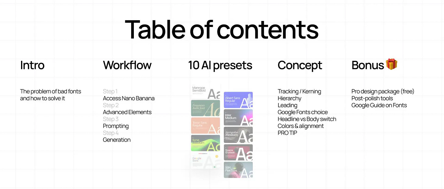
WORKFLOW (how it works)
How this works in 4 steps:
-
Nano Banana Google’s Gemini image generation model
-
Select or upload your font as an Element for consistency
-
Copy my preset-prompts → replace only [INSERT YOUR TEXT]
-
Generate → enjoy your consistent font designs
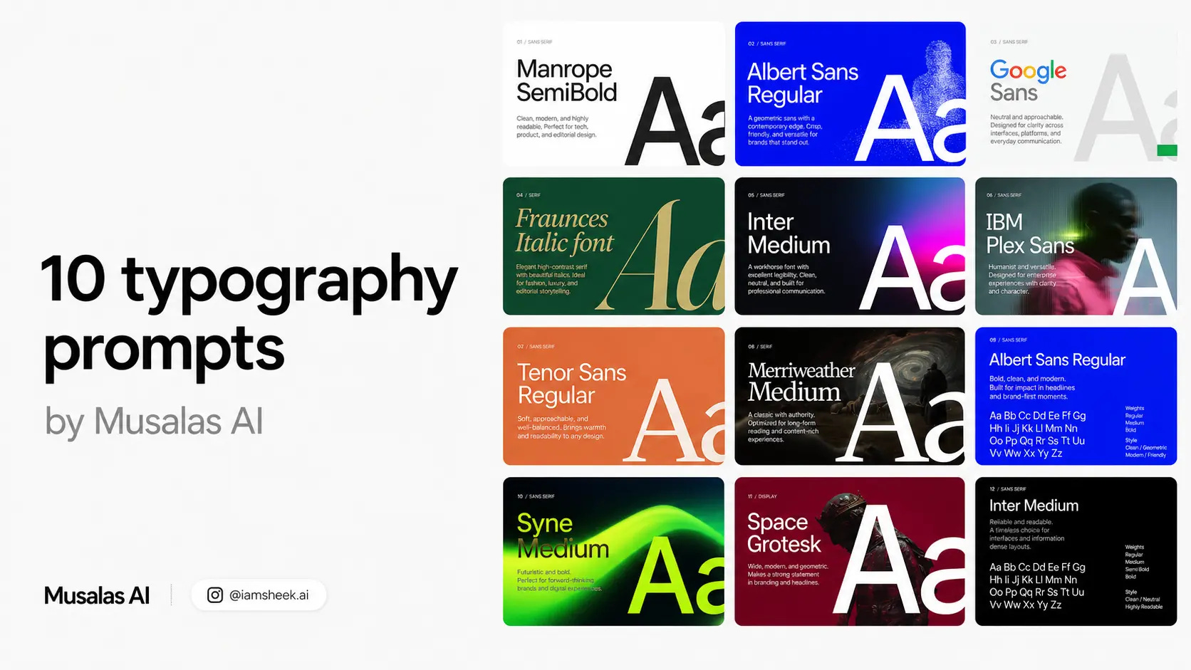
10 TYPOGRAPHIC PROMPTS
(copy & paste)
Repeat this format 10 times – each one short & scannable
How to use these prompts:
1. Copy-paste it to Nano Banana
2. Replace the “INSERT YOUR TEXT HERE” with your text
3. Change colors (type it in or use Color Picker [Alt + P])
4. Hit “Generate” and enjoy the results
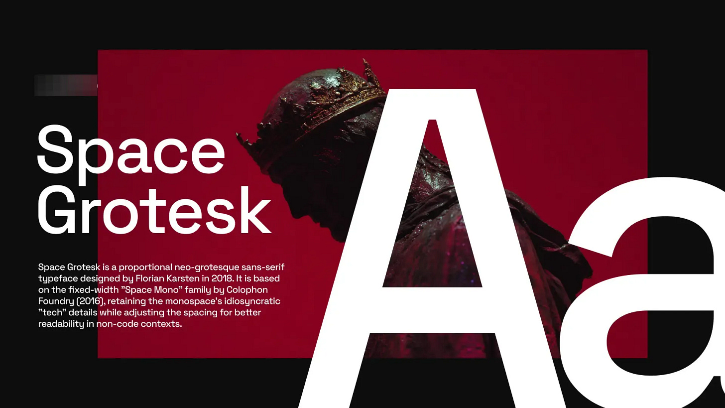
01. SPACE GROTESK
Techy, retro‑futuristic sans
Fits for:
Developer tools, Web3/crypto, tech startups, and data‑driven interfaces.
Why:
Inherits “code” DNA from Space Mono, giving a distinctive digital character that pops in headlines and UI.
PROMPT:
Render a 2D isolated text on a solid background.
[CONTENT STRICT] TARGET_TEXT:
“INSERT YOUR TEXT HERE”
ACTION: Render EXACTLY the string above.
PROHIBITED:
Do NOT generate subtitles. Do NOT generate descriptions.
[VISUAL SPECS - READ CAREFULLY]
Font Family: @Space Grotesk Font
Color: Hex #FFE3C3
Tracking: Tight (-3%).
Leading: 90%.
Alignment: Strictly Left Aligned.
[LAYOUT & ALIGNMENT]
Position: Center of the layout.
Scale: 50% of the layout width.
Background: #73001C, Solid Fill.
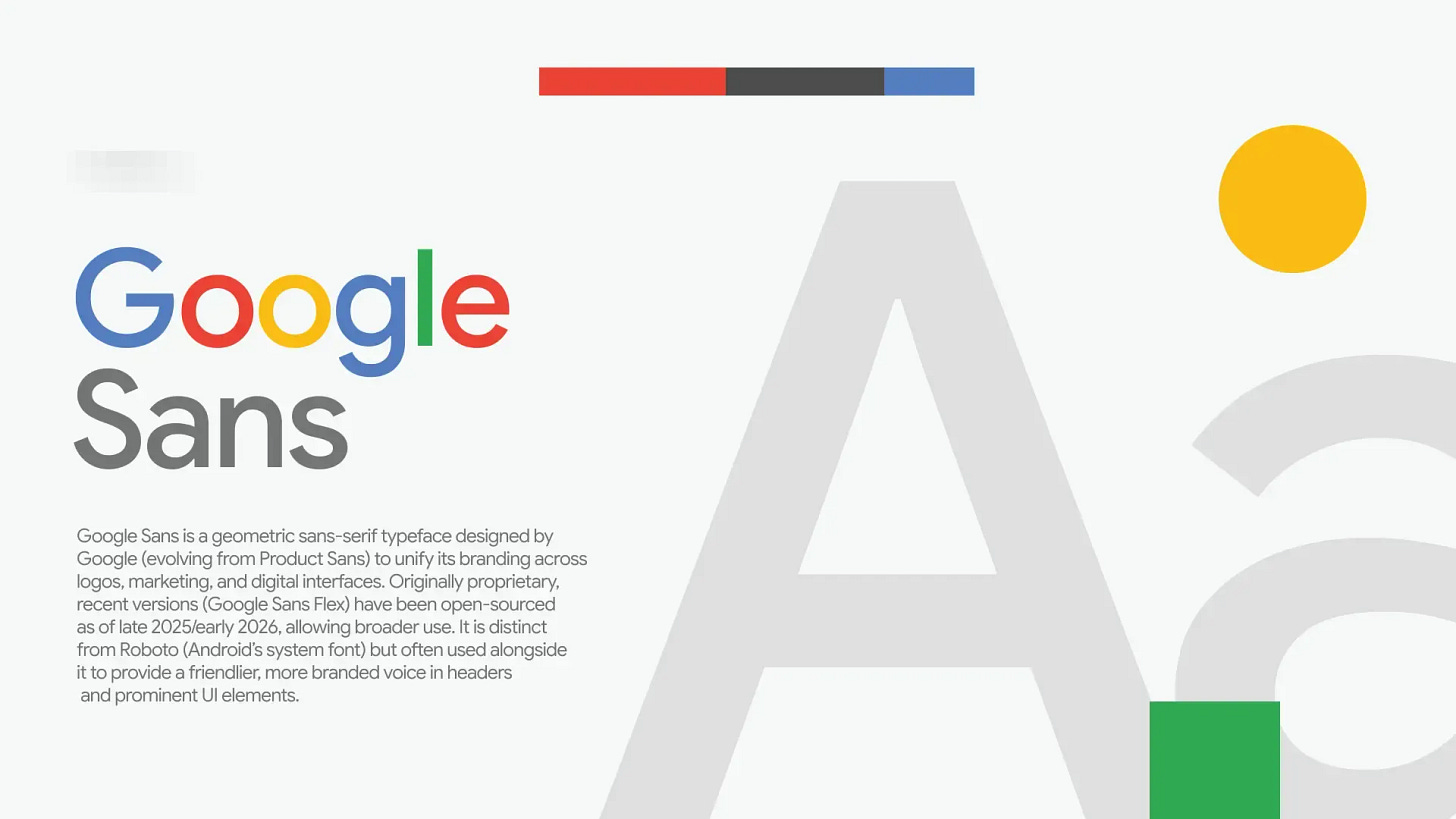
Texture: None02. GOOGLE SANS
Branded, geometric‑humanist Google look
Fits for:
Product and marketing sites that want a clean, “big tech” aesthetic.
Why:
Rounded, geometric forms feel friendly and modern, great for bold headings and hero copy.
PROMPT:
Render a 2D isolated text on a solid background.
[CONTENT STRICT] TARGET_TEXT:
“INSERT YOUR TEXT HERE”
ACTION: Render EXACTLY the string above.
PROHIBITED:
Do NOT generate subtitles. Do NOT generate descriptions.
[VISUAL SPECS - READ CAREFULLY]
Font Family: @Google Sans Font
Color: Hex #737574
Tracking: Tight (-3%).
Leading: 90%.
Alignment: Strictly Left Aligned.
[LAYOUT & ALIGNMENT]
Position: Center of the layout.
Scale: 50% of the layout width.
Background: #F6F9F8 , Solid Fill.
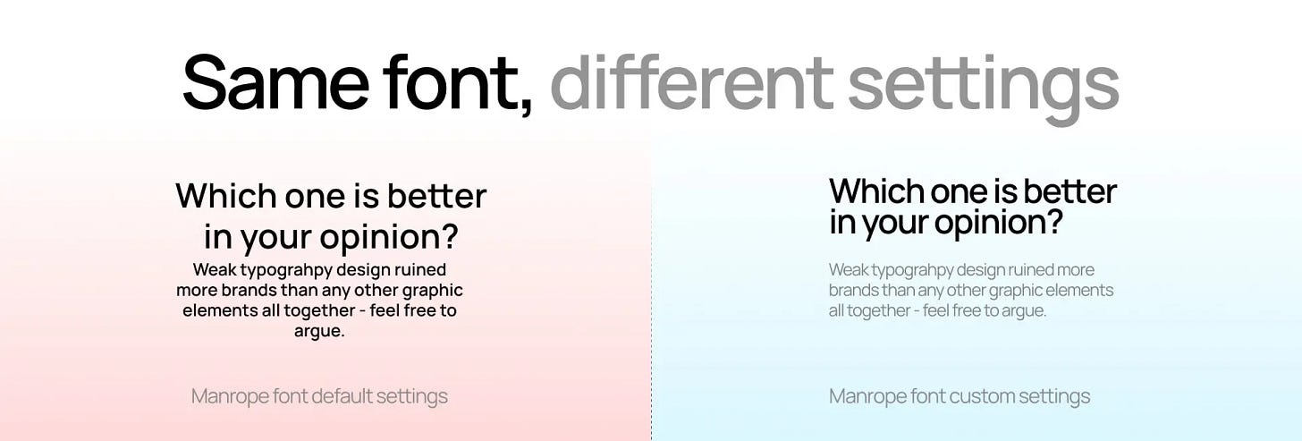
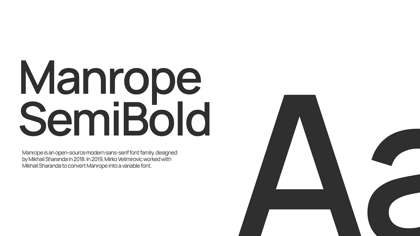
Texture: None03. MANROPE
Clarity & confidence
This is the font I use for in my social media designs.
I use Manrope SemiBold for headlines and Manrope Regular for body text to achieve a proper visual hierarchy.
Good fit for:
Digital products and interfaces, branding for tech, SaaS, and contemporary lifestyle companies.
Why:
Strong on‑screen legibility; clean, confident tone.
Clean, geometric letterforms with minimal stroke contrast give it a contemporary, tech‑friendly feel.
PROMPT:
Render a 2D isolated text on a solid background.
[CONTENT STRICT] TARGET_TEXT:
"INSERT YOUR TEXT HERE"
ACTION: Render EXACTLY the string above.
PROHIBITED:
Do NOT generate subtitles. Do NOT generate descriptions.
[VISUAL SPECS - READ CAREFULLY]
Font Family: @Manrope SemiBold font
Font Style: Upright
Color: Hex #000000
Tracking: Tight (-4%).
Leading: 90%.
Alignment: Strictly Left Aligned.
[LAYOUT & ALIGNMENT]
Position: Center of the layout.
Background: #FFFFFF, Solid Fill.
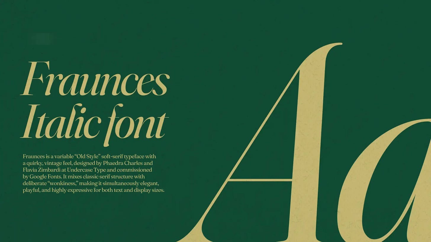
Texture: None04. FRAUNCES
Premium, “Old money” style
For: Branding and logos that want a classic serif voice with a warm, offbeat personality (e.g., heritage, food, or friendly fintech/“saucy” business vibes).
Why: Headlines, hero sections, and editorial layouts where expressive typography does the storytelling.
PROMPT:
Render a 2D isolated text on a solid background.
[CONTENT STRICT] TARGET_TEXT:
"INSERT YOUR TEXT HERE"
ACTION: Render EXACTLY the string above.
PROHIBITED:
Do NOT generate subtitles. Do NOT generate descriptions.
[VISUAL SPECS - READ CAREFULLY]
Font Family: @Fraunces Font
Color: Hex #C4B773
Tracking: Tight (-2%).
Leading: 90%.
Alignment: Strictly Left Aligned.
[LAYOUT & ALIGNMENT]
Position: Center of the layout.
Scale: 50% of the layout width.
Background: #114A34, Solid Fill.
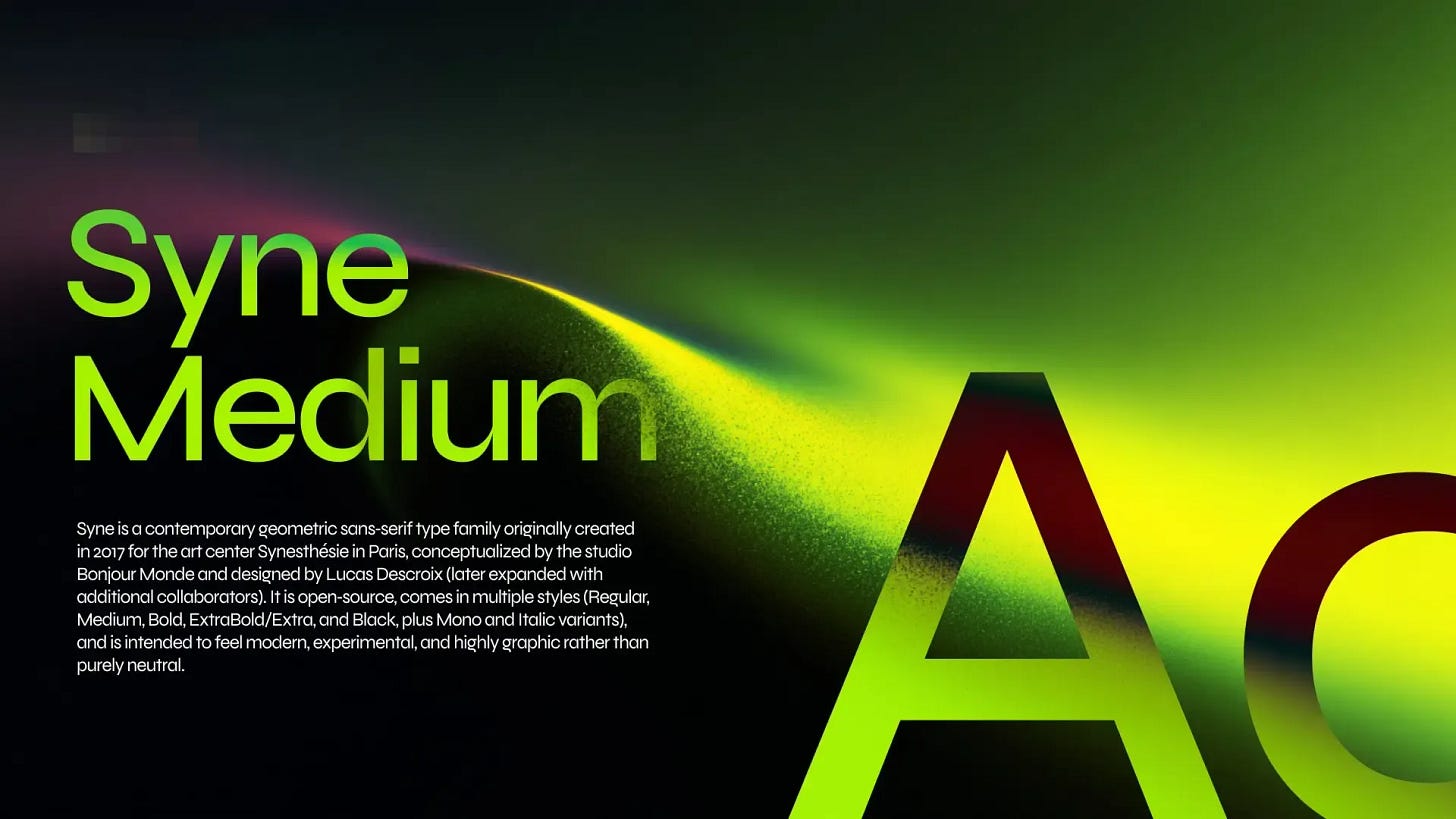
Texture: None05. SYNE
Artsier, experimental geometric sans
Fits for:
Cultural institutions, creative studios, posters, and edgy editorial layouts.
Why:
Condensed, graphic shapes and bold weights create a strong, contemporary “art center” voice at display sizes.
PROMPT:
Render a 2D isolated text on a solid background.
[CONTENT STRICT] TARGET_TEXT:
"INSERT YOUR TEXT HERE"
ACTION: Render EXACTLY the string above.
PROHIBITED:
Do NOT generate subtitles. Do NOT generate descriptions.
[VISUAL SPECS - READ CAREFULLY]
Font Family: @Syne Font
Color: Hex #FFFFFF
Tracking: Tight (-4%).
Leading: 90%.
Alignment: Strictly Left Aligned.
[LAYOUT & ALIGNMENT]
Position: Center of the layout.
Scale: 50% of the layout width.
Background: #0B2B43, Solid Fill.
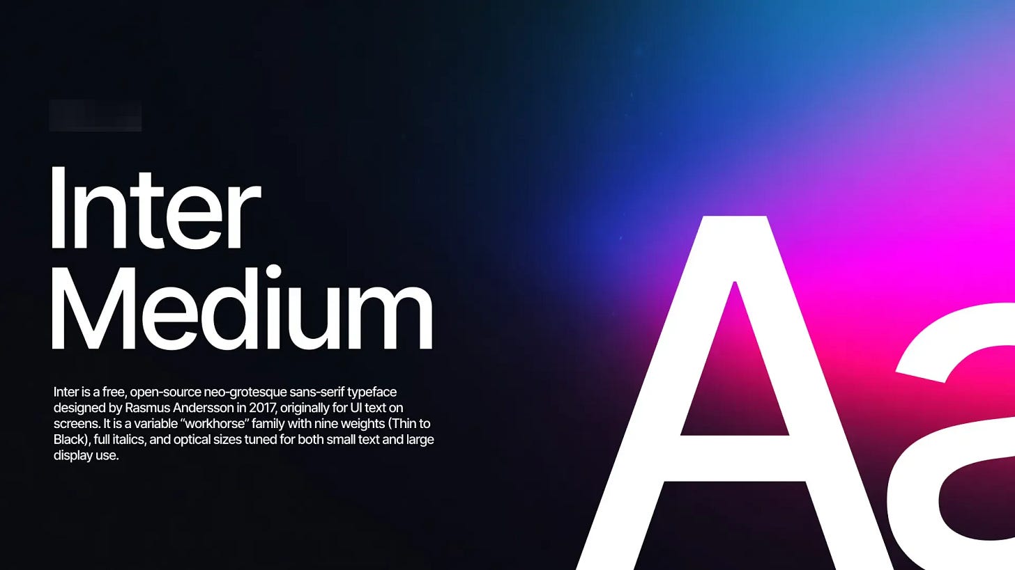
Texture: None06. INTER
System, product, and UI workhorse
Fits for:
Apps, dashboards, documentation, and any digital product needing maximum clarity.
Why:
Neutral, highly readable at small sizes with a huge weight range and excellent language/feature support.
PROMPT:
Render a 2D isolated text on a solid background.
[CONTENT STRICT] TARGET_TEXT:
"INSERT YOUR TEXT HERE"
ACTION: Render EXACTLY the string above.
PROHIBITED:
Do NOT generate subtitles. Do NOT generate descriptions.
[VISUAL SPECS - READ CAREFULLY]
Font Family: @Inter Font
Color: Hex #FFFFFF
Tracking: Tight (-6%).
Leading: 90%.
Alignment: Strictly Left Aligned.
[LAYOUT & ALIGNMENT]
Position: Center of the layout.
Scale: 50% of the layout width.
Background: #000000, Solid Fill.
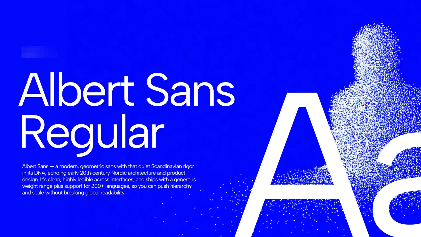
Texture: None07. ALBERT SANS
Friendly, modern, grotesque sans
Fits for:
Startups, lifestyle brands, landing pages, and simple marketing sites.
Why:
Soft, approachable shapes make it feel less corporate than strict neo‑grotesques while staying versatile.
PROMPT:
Render a 2D isolated text on a solid background.
[CONTENT STRICT] TARGET_TEXT:
"INSERT YOUR TEXT HERE"
ACTION: Render EXACTLY the string above.
PROHIBITED:
Do NOT generate subtitles. Do NOT generate descriptions.
[VISUAL SPECS - READ CAREFULLY]
Font Family: @Albert Sans font
Color: Hex #FFFFFF
Tracking: Tight (-5%).
Leading: 90%.
Alignment: Strictly Left Aligned.
[LAYOUT & ALIGNMENT]
Position: Center of the layout.
Scale: 50% of the layout width.
Background: #0208F9, Solid Fill.
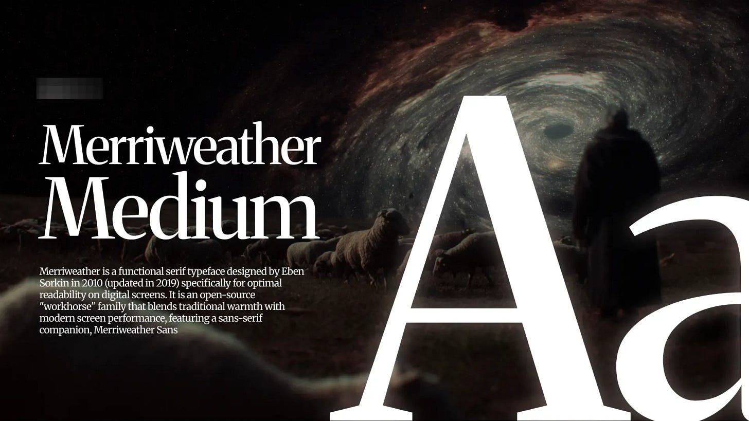
Texture: None08. MERRIWEATHER
Screen‑optimized classic serif
Fits for:
Blogs, news sites, long‑form reading, and editorial platforms.
Why:
Large x‑height and sturdy forms keep paragraphs comfortable and readable, especially on digital displays.
PROMPT:
Render a 2D isolated text on a solid background.
[CONTENT STRICT] TARGET_TEXT:
"INSERT YOUR TEXT HERE"
ACTION: Render EXACTLY the string above.
PROHIBITED:
Do NOT generate subtitles. Do NOT generate descriptions.
[VISUAL SPECS - READ CAREFULLY]
Font Family: @Merriweather Font
Color: Hex #FFE3C3
Tracking: Tight (-3%).
Leading: 90%.
Alignment: Strictly Left Aligned.
[LAYOUT & ALIGNMENT]
Position: Center of the layout.
Scale: 50% of the layout width.
Background: #5B3A30, Solid Fill.
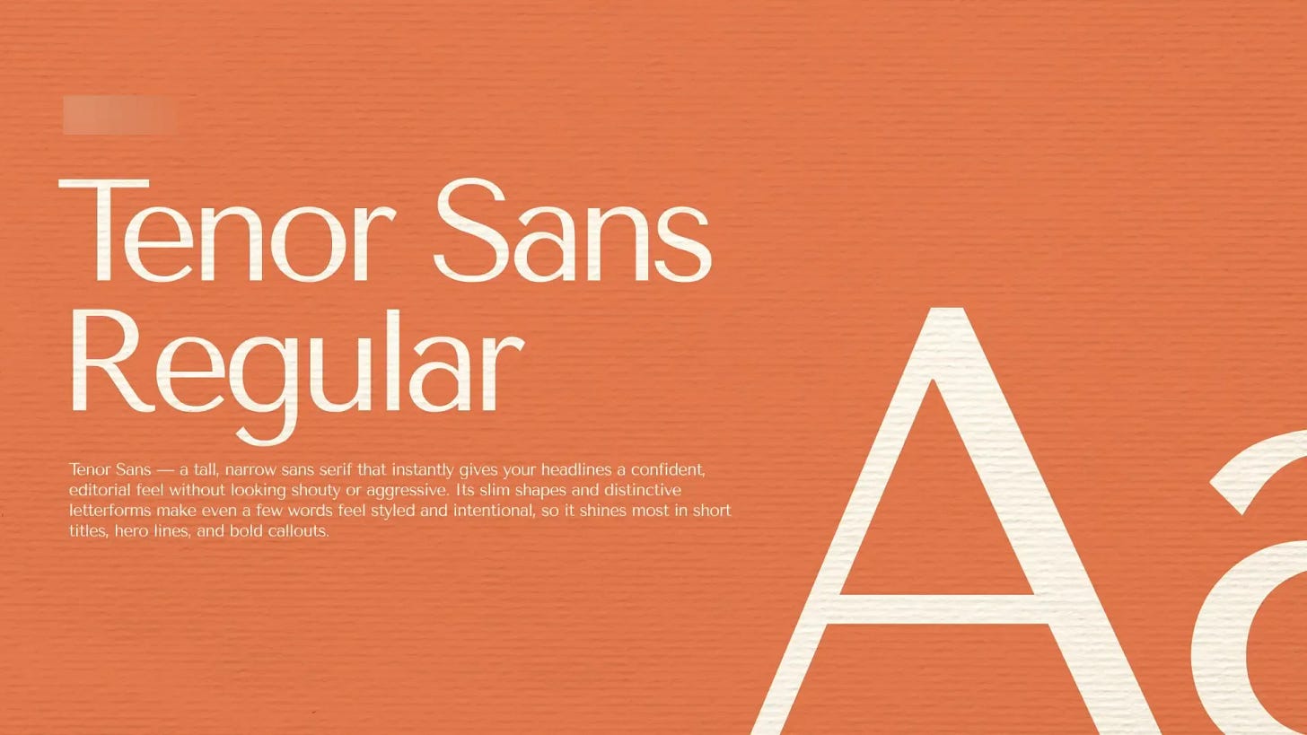
Texture: None09. TENOR SANS
Refined, editorial sans
Fits for:
Magazines, minimalist brands, and content‑heavy layouts with a sophisticated tone.
Why:
Narrow proportions and subtle personality work well for headlines and shorter text with an editorial feel.
PROMPT:
Render a 2D isolated text on a solid background.
[CONTENT STRICT] TARGET_TEXT:
"INSERT YOUR TEXT HERE"
ACTION: Render EXACTLY the string above.
PROHIBITED:
Do NOT generate subtitles. Do NOT generate descriptions.
[VISUAL SPECS - READ CAREFULLY]
Font Family: @Tenor Sans Font
Color: Hex #FFFFFF
Tracking: Tight (-4%).
Leading: 90%.
Alignment: Strictly Left Aligned.
[LAYOUT & ALIGNMENT]
Position: Center of the layout.
Scale: 50% of the layout width.
Background: #E67D54, Solid Fill.
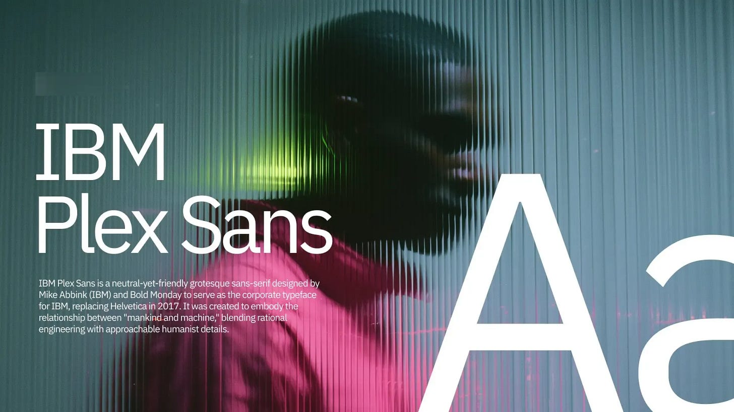
Texture: None10. IBM PLEX SANS
Corporate, engineered humanist sans
Fits for:
Enterprise products, design systems, documentation, and tech brands.
Why:
Built for IBM’s ecosystem, it balances technical precision with human warmth and scales well from UI to brand.
PROMPT:
Render a 2D isolated text on a solid background.

[CONTENT STRICT] TARGET_TEXT:
"INSERT YOUR TEXT HERE"

ACTION: Render EXACTLY the string above.

PROHIBITED:
Do NOT generate subtitles. Do NOT generate descriptions.

[VISUAL SPECS - READ CAREFULLY]
Font Family: @IBM Plex Sans Font

Color: Hex #FFFFFF

Tracking: Tight (-3%).
Leading: 90%.
Alignment: Strictly Left Aligned.

[LAYOUT & ALIGNMENT]
Position: Center of the layout.
Scale: 50% of the layout width.
Background:  #09524F , Solid Fill.

Texture: None
BONUS 
Free bonus: massive pack of assets for $0
-
Free font pairings – curated by me
-
Royalty-free music track – with license for commercial use
-
Pack of video transitions
-
Pack of prompts for video creators
-
Media kit template – to help you land clients
Get your pack here: Freebies
Why care about typography? Google article:
https://fonts.google.com/knowledge/introducing_type/why_care_about_typography
This is the exact typography workflow I use myself.
Now it’s yours – no gatekeeping.
Save this article as your font cheat-sheet.
Follow for more articles & workflows
If this article helped you, share it with your friends and show me your experiments by mentioning @iamsheek.ai on Instagram!
If this resonated, share it with one creator who’s been fighting their AI tools instead of using them. Subscribe now
And subscribe so you don’t miss what’s coming next week.
It’s going to be provocative.
Obviously.
Be that person.
This newsletter is entirely free. I want to be the greatest filter to the permanent AI noise.
Some people came because of my Instagram. But most readers subscribed because someone they trusted sent one of my articles to them.
If this article helped you, be that person for someone else (and share it): Share
It does not cost you anything to share. And sharing keeps this newsletter free!
If someone sent you this, first thank them, and don’t miss the next guide by subscribing for free. Bonus point if you introduce yourself in the comment section.